The Visualize step turns the data flowing into it into tables, charts, and key metrics. Connect any step in your flow and you get an interactive view that can show on the canvas, sync to the flow dashboard, and be shared with your team.Documentation Index
Fetch the complete documentation index at: https://parabola.io/docs/llms.txt
Use this file to discover all available pages before exploring further.
Add a Visualize step
When first added and connected to another step, Visualize expands and shows the incoming data as a table on the canvas. Click Edit this View to open the step and customize the visualization or add new views.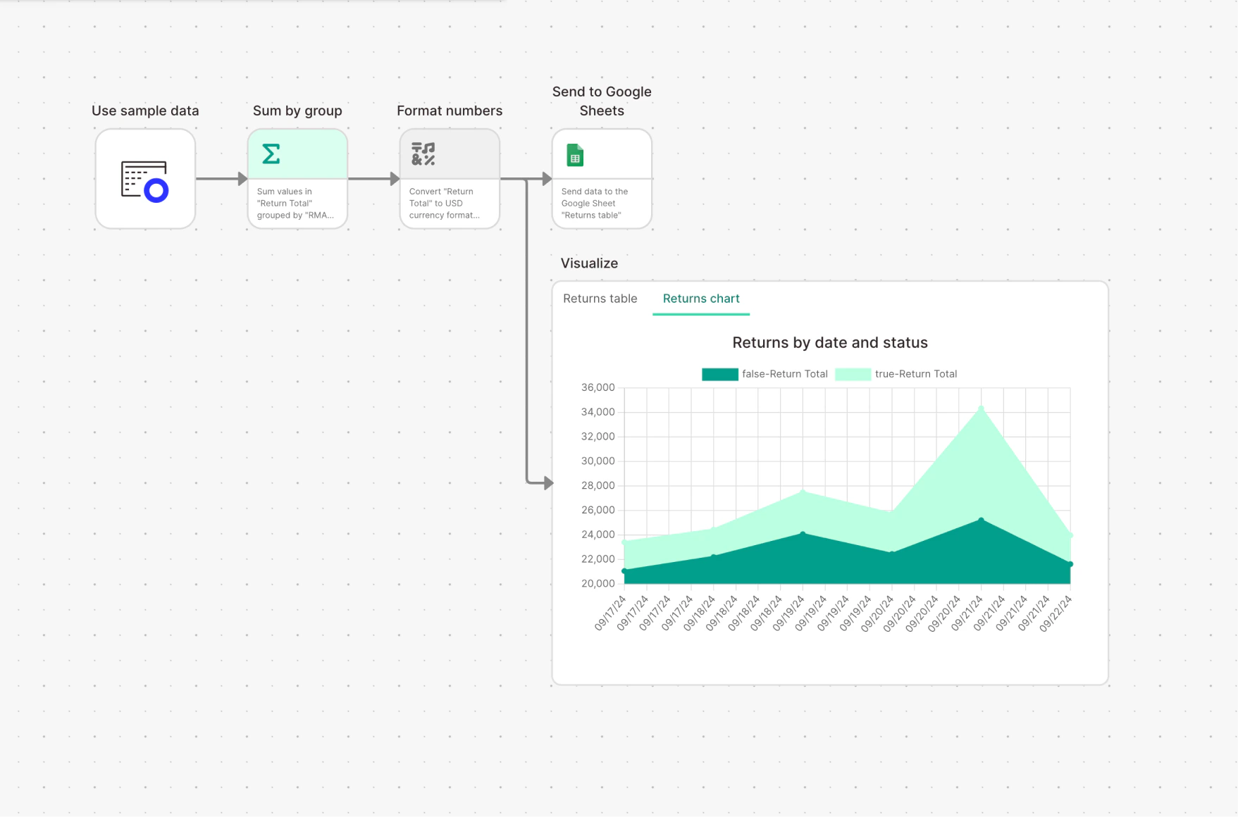
Sharing
Anyone with access to the flow can see the dashboard:- Can edit — edit and create views. Changes are immediately visible to everyone with access.
- Can view — see all views, can’t make changes.

Creating and managing views
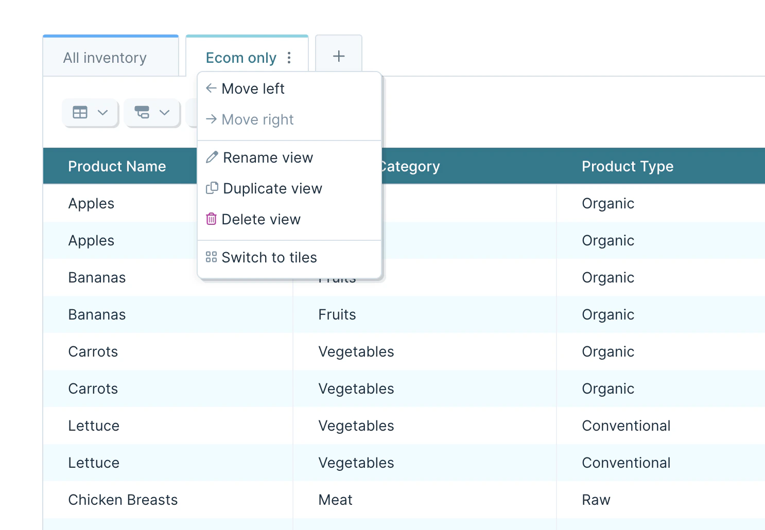
Views are individual visualizations inside a Visualize step. Show them as tables, featured metrics, or charts.- Tabs look like spreadsheet tabs along the top of the page. Drag to rearrange.
- Tiles show every view at once. Resize with the handles, drag to rearrange.
- Views refresh when the flow runs, when the base data changes, or when you change view settings.
- The overflow menu next to a view name lets you move, rename, duplicate, or delete it. The same menu switches the page layout between tabs and tiles.
- Add new views with the plus icon next to the last tab, or the Add view button below the last tile. With a lot of tabs, use the tab list menu on the right side.
- Duplicated and new tab views land in the private views section — scroll down to find them.
View types
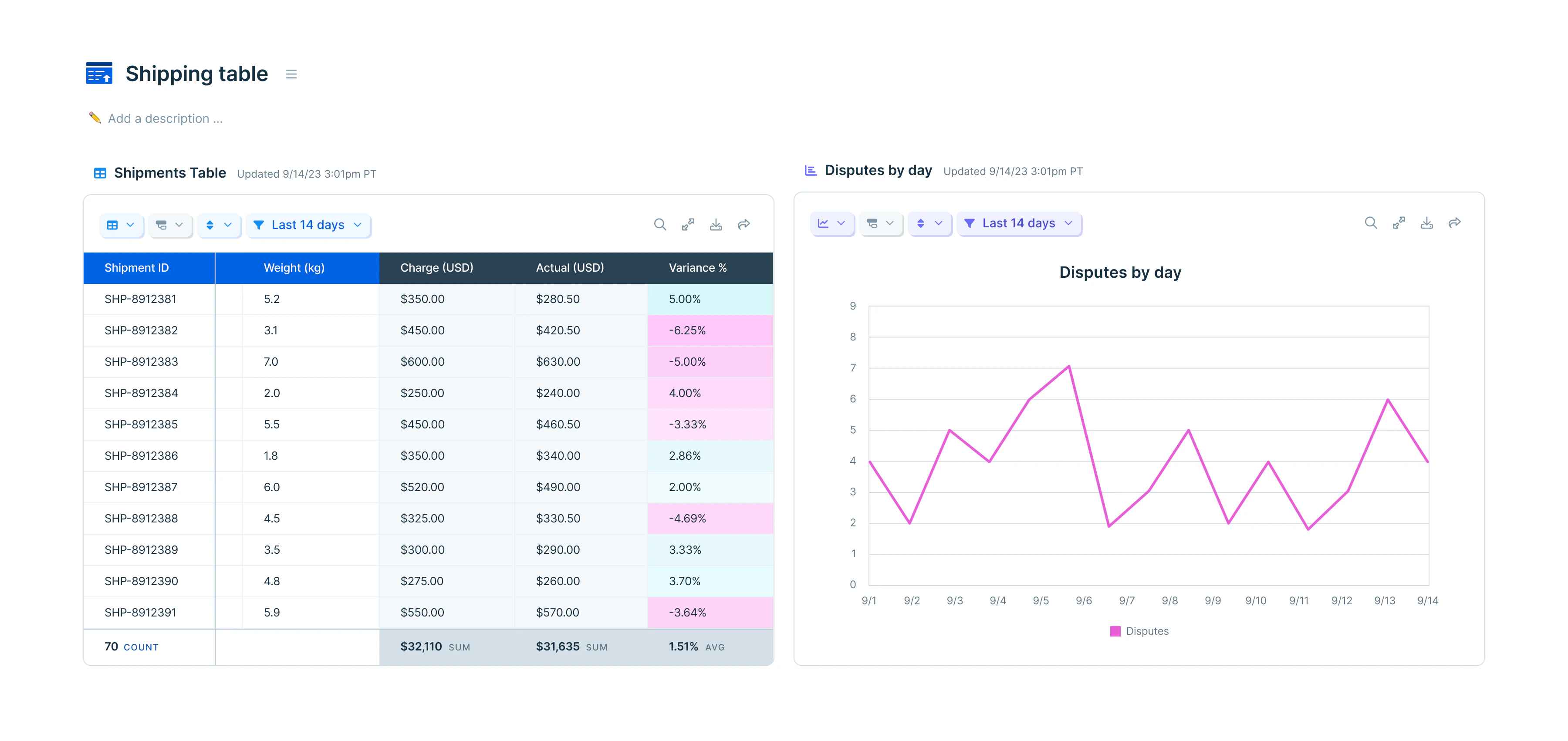
Pick a view type from the Table/chart options menu.Tables
Tables are the default. They work for any rows of data, styled, calculated, grouped, sorted, or filtered. The table options menu (top left, below the tab title) holds column formatting and aggregation calculations.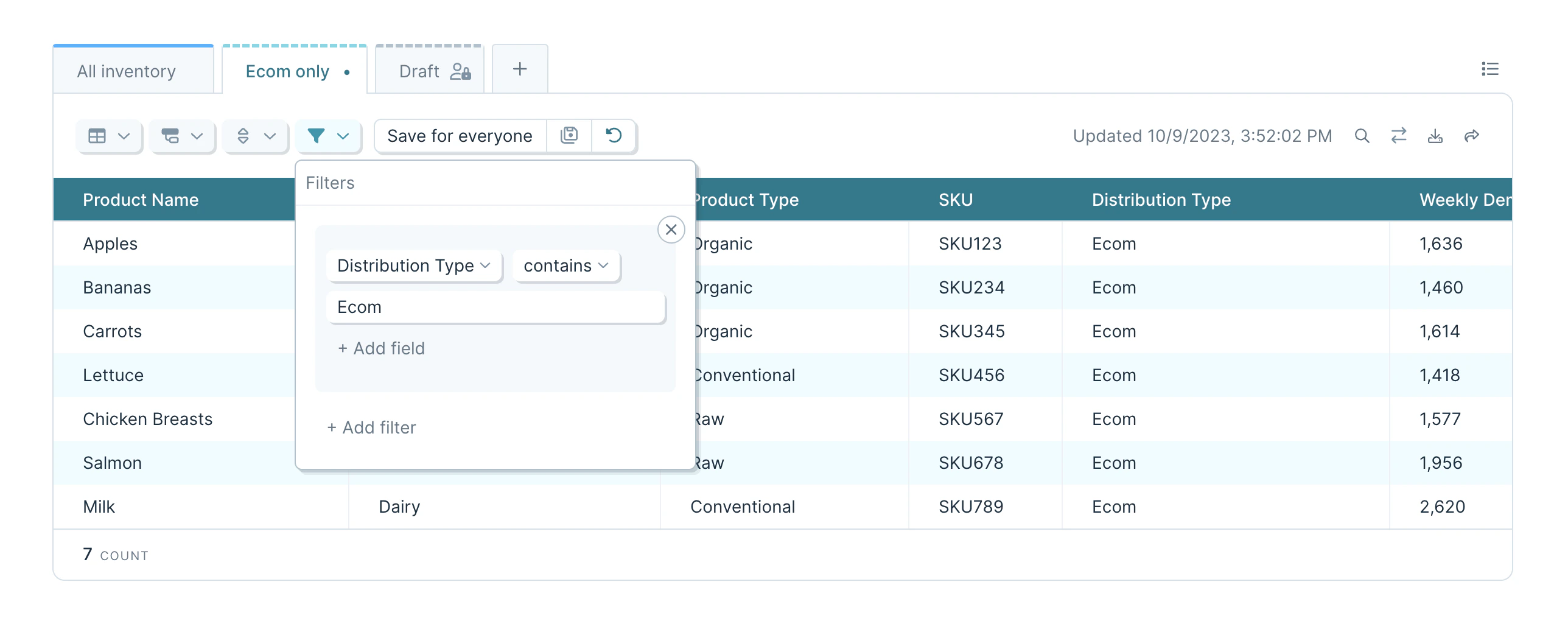
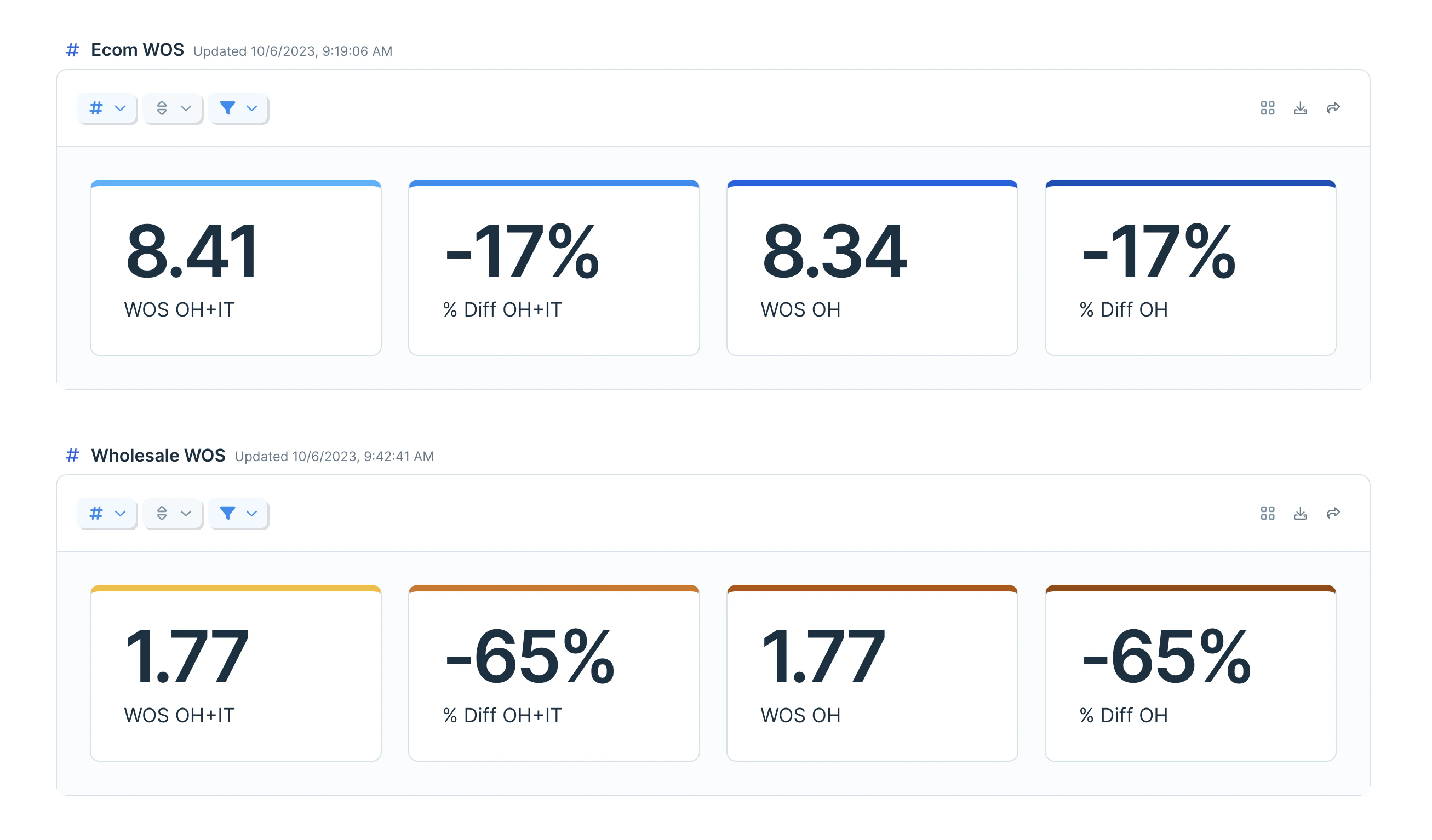
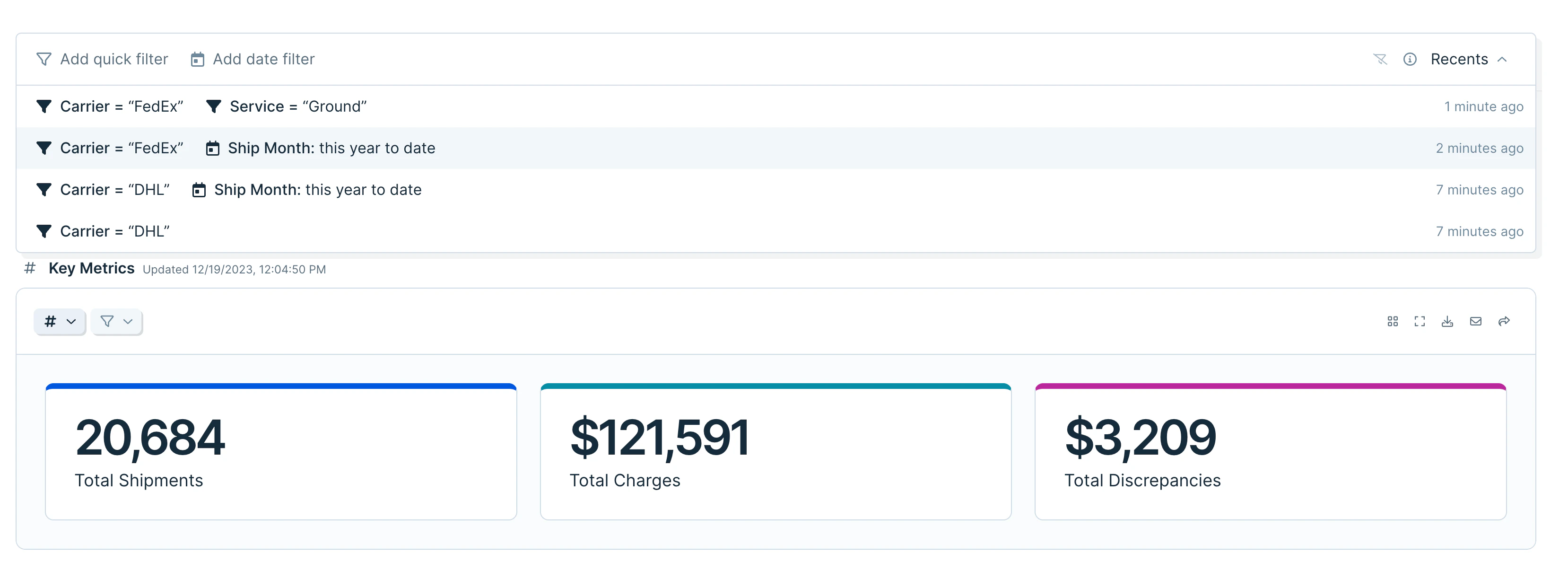
Featured metrics
Featured metrics show a single column calculation prominently — a total, an average, a count. Each metric can be renamed, given a color, and formatted (date, number, percent, currency, accounting). The metrics options menu sits in the same spot as table options, marked with a#.
Charts and graphs
Supported chart types: column, line, area, scatter, and mixed (multiple types combined). The chart options menu (mini bar graph icon) controls labels, colors, gridlines, and legend placement.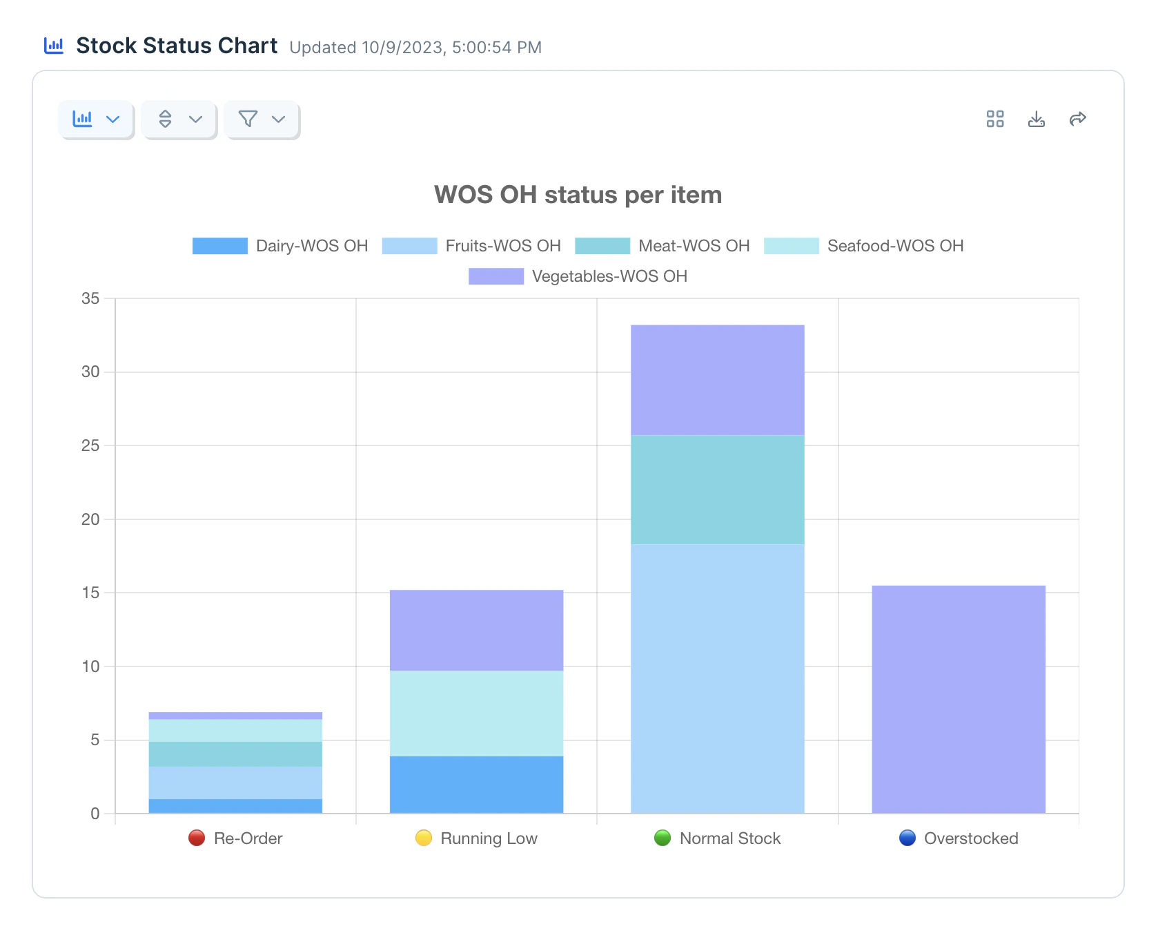
- Categorize by … — split a Y axis value by a subcategory. Example: split total revenue by store location to get one bar per store.
- Categorize and stack by … — same split, stacked into one bar per X-axis value with colored segments per subcategory.
- Stack series — stack multiple series on a single X-axis value into one bar.
- Add a chart title from the Table/chart options menu.
- Click an item in the legend to temporarily hide that series; click again to show it.
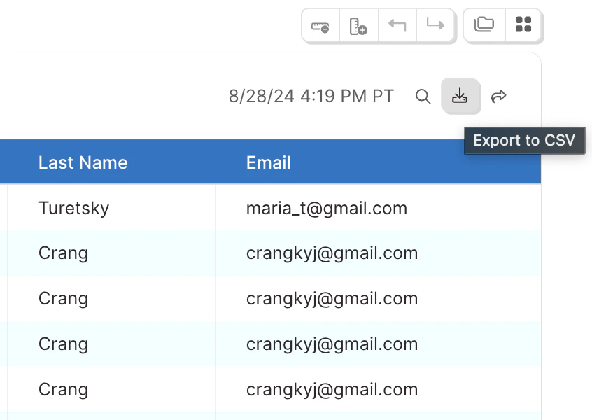
- Charts and graphs export as CSVs that mirror the underlying table.
Calculations, grouping, sorting, filtering
Column calculations. One calculation per column:- Count all — rows in the entire table and within each group
- Count unique — unique values in the column (case- and space-sensitive)
- Count empty / Count not empty — blank vs. populated cells
- Sum — total of numeric values; non-numeric and blank cells skipped
- Average — sum / count of values used; non-numeric and blank skipped
- Median — middle value where half are higher and half are lower
- Min / Max — smallest / largest numeric value
--.
Grouping. Tables can be grouped up to six times. Groups apply in nested order — the first rule creates top-level groups, each subsequent rule creates subgroups. After six groups, + Add grouping is disabled. Sort options inside the group rules control the order groups display; normal sort rules order rows within each group.
Sorts. Click Sort (or use the view options menu) to add a sort rule.
Filters. Click Filter (or use the view options menu) to add a filter rule. Date filters support both relative ranges (“Last 7 days”) and exact ranges via Filter dates to….
Quick filters
Click Quick Filter at the top right of the dashboard to toggle the filter bar. Use Add quick filter or Add date filter to filter specific columns across every view on the page.- Quick filters are personal — they don’t affect other users — and refresh resets them.
- After eight seconds, the current combination is saved in the Recents drawer on the right side of the filter bar. Saved sets reapply with one click and stay private to you.
- Quick filters require at least one table on the flow. Click above the first table on the published flow page to add one. The filter bar follows you as you scroll.
- Multiple quick filters combine with AND logic and apply on top of any filters set on individual views. Use the clear icon to remove all filters at once.
Data formatting
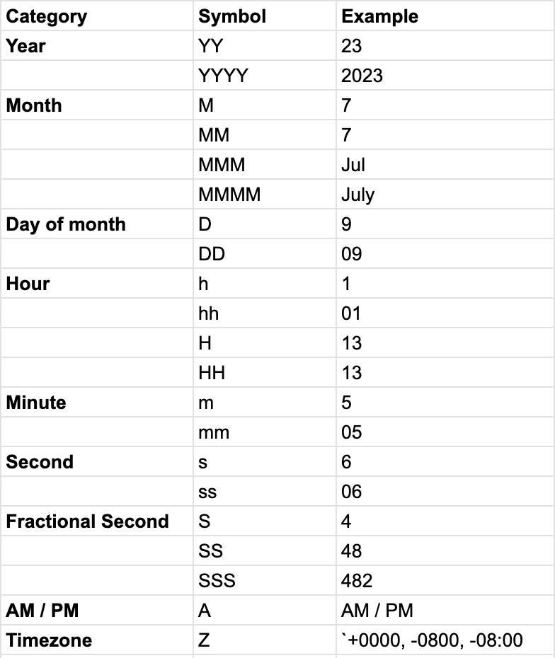
Format columns, metrics, and axes from the Table/Chart Options button (leftmost in the control row). Use auto-format or pick a category and format manually. For charts, the X axis is auto-formatted by default. All series in each Y axis share a single format. Adjust axis formatting with the gear icon next to the axis name. Formatting applies to columns, group aggregations, the grand total row, and featured metrics. Grouping uses the underlying unformatted value to decide which row goes into which group. For dates, format is auto-detected. If your dates aren’t recognized, click the three dots next to the output format field and enter a custom starting format.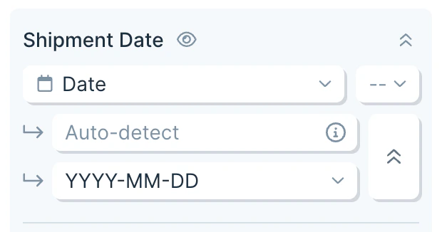
MM-DD to MM-DD-YYYY), the missing parts default to:
- Day → 1
- Month → January
- Year → 2000
Hiding and freezing
Use Table/Chart Options to hide columns from a view or freeze the first column or first row. A few notes on hidden columns:- They can still be used for sorting, grouping, and filtering — those rules apply before hiding.
- They don’t appear in search results unless Display all columns is enabled.
- They can be filtered with quick filters.
- They are included in CSV exports.
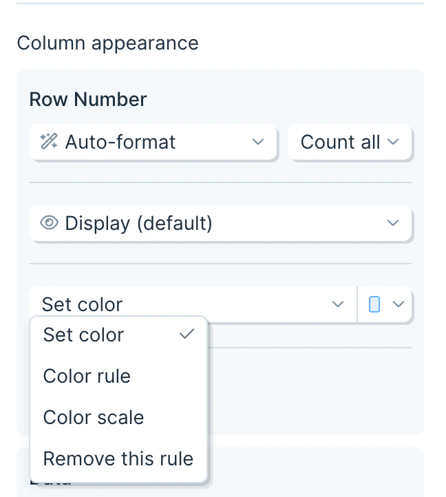
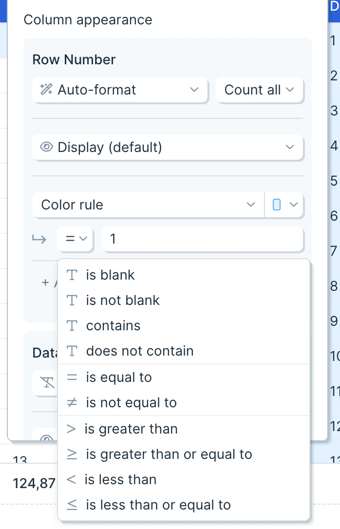
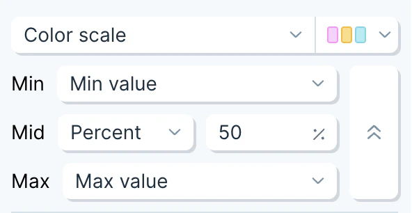
Conditional formatting
From the table options menu, click Add color rule to apply formatting to a column.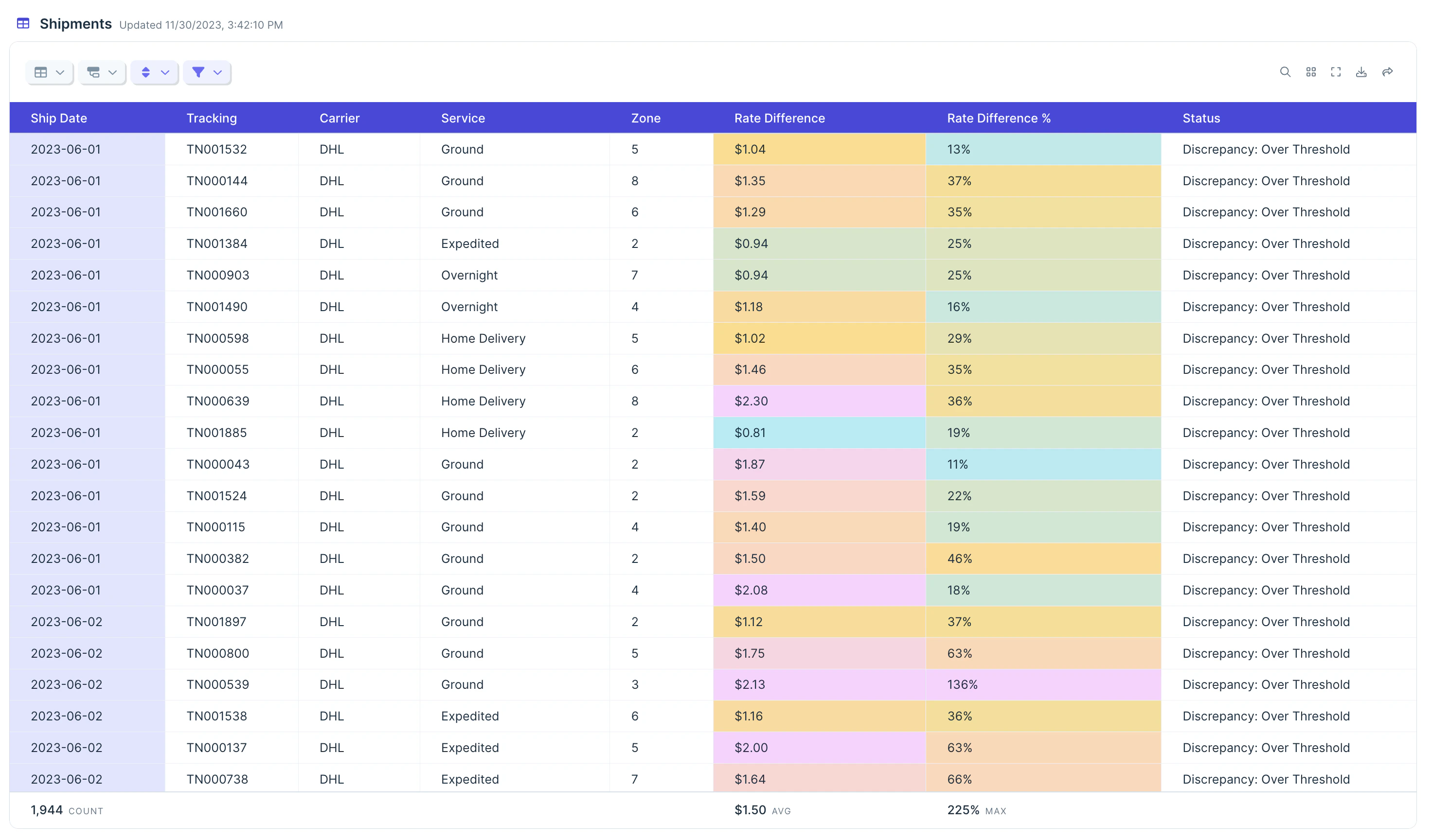
- Set color — apply one color to every cell in the column.
- Color rule — color cells that match a condition.
- Color scale — apply a 2- or 3-color gradient across the column.
Related steps
- Send to Parabola Table — store historical data the Visualize step can pull from
- Filter rows — trim the dataset before visualizing
- Format dates — for clean date axes
- Format numbers — for currency, percent, and other number formatting upstream of the chart
- Send to Slack — push key metrics to a channel alongside the dashboard